Image Details
4/24/2026
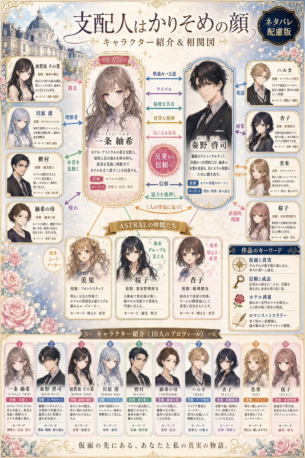
Using REFERENCE_0 as the cast reference, transform the simple lineup into an ornate Japanese light-novel character relationship chart poster. Keep the same 10 named characters and reuse their existing portrait art as the base visuals, but redesign the layout into a polished infographic on a soft cream and pale-blue fantasy background with decorative borders, sparkles, roses, and a small European-style hotel building vignette in the upper left. Add a large Japanese title at the top, 「支配人はかりそめの顔」, with the subtitle 「キャラクター紹介&相関図」, and place a dark badge in the upper right that says 「ネタバレ配慮版」. Put the heroine 一条 紬希 in the center as the main focus in a framed character card labeled 「主人公」, and place 秦野 啓司 in a large framed card on the right as the key counterpart. Arrange the remaining 8 characters around them in individual profile cards: 加賀坂 その葉, 川原 澪, 樫村, 紬希の母, ハルカ, 杏子, 美果, 桜子. Connect the characters with multiple colored arrows and relationship labels to visualize the network; include exactly 14 visible relationship labels: 「親友」, 「理解者」, 「本音を見抜く」, 「憧れ」, 「相談」, 「画策」, 「仲直り中」, 「直感的理解」, 「メンター」, 「実務支援」, 「保護者的存在」, 「後輩 ムードメーカー」, 「後輩 グループを支える」, 「後輩 明るさ・希望」. Also add the 8 central horizontal relationship callouts between 一条 紬希 and 秦野 啓司: 「偽溶み→公認」, 「ライバル」, 「秘密を共有」, 「対等な相棒」, 「気になる存在」, plus a pink central badge reading 「反発から信頼へ」, and 3 lower callouts: 「信頼」, 「協力を後押し」, 「二人の空気に気づく」. Include a gold-ribbon group label above the three lower girls that says 「ASTRALの仲間たち」. Add a bottom section with exactly 10 smaller summary cards, one for each character again, lined up across the width. On the far right, add 2 boxed sidebar sections titled 「作品のキーワード」 and 「関係の見どころ」; the first should contain 4 bullet items with icons, and the second should contain 4 bullet items with icons. Fill every card with dense Japanese profile text and role tags in a clean editorial style, as if for a promotional relationship guide included with a novel. Make the overall design elegant, readable, romantic-mystery themed, and magazine-quality.
Related Images
![{
"type": "live stream UI mockup",
"subject": {
"description": "portrait of {argument name=\"host name\" default=\"Elon Musk\"}, smiling, wearing a black t-shirt with a white technical schematic graphic",
"background": "left side shows a screen with '{argument name=\"left background logo\" default=\"SPACEX\"}' text, right side shows a red '{argument name=\"right background logo\" default=\"Tesla T logo\"}' and a dark car"
},
"ui_overlay": {
"top_header": {
"host_info": "avatar, name '{argument name=\"host name\" default=\"Elon Musk\"}', subtext '55.6万本场点赞', red '关注' button",
"rank_badge": "gold coin icon with '全站第1名'",
"viewer_stats": "3 top viewer avatars with '12.3w', '8.6w', '5.7w', total '68.7万', 'X' close button",
"right_links": "'更多直播 >', '礼物展馆 0/24' with blue '经典' tag"
},
"mid_left_gifts": {
"count": 2,
"items": [
"avatar '科技爱好者', '送小心心', heart icon x 1314",
"avatar '星辰大海', '送火箭', rocket icon x 666"
]
},
"bottom_left_chat": {
"system_message": "level 37 badge '宇宙漫游者 加入了直播间'",
"message_count": 7,
"messages": [
"小火箭: 马斯克!未来可期!🚀",
"future: 特斯拉Model 2什么时候出?",
"星空梦想家: SpaceX今年能上火星吗?",
"AI探索者: Neuralink进展如何?",
"帅气的网友: 马总好!",
"Mars: 第一次来你的直播,超激动!",
"用户123: 讲讲AI吧,会取代人类吗?"
]
},
"bottom_right_product_card": {
"hot_tag": "orange '热卖 x 1888'",
"image": "Tesla Cybertruck",
"title": "{argument name=\"product name\" default=\"特斯拉Cybertruck 电动皮卡\"}",
"price": "{argument name=\"product price\" default=\"¥ 1,618,000\"}",
"button": "red '抢' button",
"floating_animation": "translucent hearts floating up the right edge"
},
"bottom_bar": {
"input_field": "'说点什么...'",
"icons": ["smiley face", "three dots", "shopping cart", "gift box", "share"]
}
}
}](https://cdn.gptimg-2.io/generations/kk6WCGbk9btnWWgMu4Mm0HIGZqYxPEnt/42c9374d-bece-4ea2-b359-939589de84db.webp)

![{
"type": "evolutionary timeline infographic",
"instruction": "Using REFERENCE_0 as a structural base, transform the flat vector design into a highly realistic 3D infographic. Replace the smooth ramps with distinct stone steps and upgrade all organisms to photorealistic 3D models.",
"style": {
"background": "{argument name=\"background style\" default=\"vintage textured parchment paper\"}",
"staircase": "{argument name=\"staircase material\" default=\"realistic textured stone blocks\"}",
"subjects": "{argument name=\"organism style\" default=\"highly detailed photorealistic 3D renders\"}"
},
"layout": {
"main_title": "{argument name=\"main title\" default=\"人类演化\"}",
"sections": [
{
"position": "left sidebar",
"count": 8,
"labels": ["L0: 单细胞生命", "L1: 多细胞生物", "L2: 动物界", "L3: 脊索动物", "L4: 上陆革命", "L5: 哺乳纲", "L6: 人科演化", "L7: 智人纪元"]
},
{
"position": "top right",
"title": "获得的功能 / 失去的功能",
"description": "Legend with plus and minus icons"
},
{
"position": "bottom center",
"title": "演化关键里程碑",
"count": 6,
"description": "Timeline with a silhouette graphic of 6 figures showing ape-to-human evolution"
}
],
"centerpiece": {
"description": "Winding stone staircase with 25 numbered steps featuring specific organisms.",
"count": 25,
"notable_elements": [
"Step 07: Jellyfish",
"Step 09: Ammonite",
"Step 10: Trilobite",
"Step 24: Walking human",
"Step 25: {argument name=\"future evolution concept\" default=\"glowing cosmic silhouette with a question mark\"}"
]
}
}
}](https://cdn.gptimg-2.io/generations/fcDzQHIInBm6fpo9Ddzbg8n2huBp8Uhs/7d14b573-3b37-49b7-8cee-14b80404ef0d.webp)
![{
"type": "illustrated map infographic",
"style": "{argument name=\"art style\" default=\"watercolor and ink hand-drawn illustration on vintage parchment\"}",
"title_section": {
"text": "{argument name=\"city name\" default=\"成都\"} {argument name=\"map title\" default=\"吃货暴走地图\"}",
"mascot": "cartoon red chili pepper wearing sunglasses and giving a thumbs up"
},
"border": "{argument name=\"border decoration\" default=\"vine of green leaves and red chili peppers\"}",
"layout": {
"background": "textured beige parchment paper with yellow roads, blue rivers, and green park areas",
"sections": [
{
"title": "landmarks",
"count": 6,
"illustrations": ["traditional pavilion", "traditional monastery", "modern skyscraper with climbing panda", "tall TV tower", "traditional gate", "industrial buildings"],
"labels": ["人民公园", "文殊院", "IFS", "339电视塔", "宽窄巷子", "东郊记忆"]
},
{
"title": "food_spots",
"count": 12,
"illustrations": ["mapo tofu", "dumplings in chili oil", "skewers in pot", "sticky rice balls", "egg baking cake", "nine-grid hotpot", "sweet potato noodles", "cold skewers", "spicy mixed dish", "covered tea bowl", "ice jelly dessert", "spicy rabbit heads"],
"labels": ["1 陈麻婆豆腐", "2 钟水饺", "3 春熙路", "4 宽窄巷子·三大炮", "5 建设路·叶婆婆蛋烘糕", "6 玉林路·小龙坎火锅", "7 香香巷·肥肠粉", "8 武侯祠大街·钵钵鸡", "9 东郊记忆·冒椒火辣", "10 人民公园·鹤鸣茶社", "11 锦里古街·冰粉", "12 双流老妈兔头"]
},
{
"title": "图例",
"position": "bottom-right",
"count": 5,
"items": ["red dot", "green house", "green tree", "blue line", "yellow double line"],
"labels": ["美食地点", "地标景点", "公园绿地", "河流湖泊", "主要道路"]
}
],
"centerpiece": "giant panda sitting and eating bamboo",
"bottom_right_extras": ["vintage compass rose with N, S, E, W", "disclaimer text '温馨提示:吃辣需谨慎,肠胃要保护~' with a red chili pepper icon"]
}
}](https://cdn.gptimg-2.io/generations/fcDzQHIInBm6fpo9Ddzbg8n2huBp8Uhs/6ffbfc55-c9d3-4ab5-93e0-c444ca92d8c9.png)
![{"type":"fitness gym website hero section mockup","style":"ultra-polished modern Japanese landing page, premium sports branding, dark neon blue color grading, high contrast, cinematic advertising look, realistic photo composited with glossy UI design","brand":{"name":"{argument name=\"brand name\" default=\"BLUE IMPACT GYM\"}","logo":"sharp angular blue-and-white lightning emblem to the left of the brand name"},"canvas":{"aspect_ratio":"16:9","composition":"single full-width first-view website header"},"background":{"theme":"dark luxury gym interior with blurred equipment and dramatic blue light streaks","effects":["electric blue diagonal motion lines","lens flares","glowing highlights","subtle smoky depth","metallic reflections"]},"navigation":{"position":"top bar","count":5,"items":["特徴","プラン・料金","店舗情報","資料請求","お問い合わせ"],"style":"white Japanese text links centered, two outlined/glowing CTA buttons on the right"},"main_visual":{"subject":"muscular Asian male personal trainer in his 20s to 30s, upper body prominently shown on the right half, holding a black dumbbell near his torso, wearing a fitted black sleeveless athletic tank top, sweaty skin, defined shoulders and arms, intense premium fitness campaign look","face":"partially frontal portrait with confident posture","lighting":"hard rim light and cool blue highlights emphasizing muscle definition"},"headline":{"position":"left-center","text":"{argument name=\"headline text\" default=\"限界を、超えろ。\"}","style":"very large bold distressed Japanese display typography in white, dynamic slanted layout, gritty texture"},"subcopy":{"position":"left-lower under headline","text":"20代〜30代男性のための、本気で変わるトレーニング空間。理想のカラダづくりを最短でサポート。","style":"smaller white Japanese text, 2 lines, clean sans-serif"},"trainer_profile":{"position":"right side vertical text beside the model","count":3,"items":["全日本マッスル協会 副会長","筋肉 凄蔵","トレーナー歴12年・累計生徒数2000人以上"],"style":"vertical white Japanese text, premium editorial arrangement"},"cta_area":{"position":"lower left to center","count":3,"buttons":[{"label":"無料体験はこちら","style":"primary glowing blue gradient rounded rectangle"},{"label":"料金プランを見る","style":"dark transparent rounded rectangle with white border"},{"label":"お問合せ","style":"dark transparent rounded rectangle with white border"}]},"campaign_banner":{"position":"lower right overlapping the subject","count":3,"texts":["今なら","入会金0円","キャンペーン実施中!"],"style":"bold blue translucent ribbon banner, oversized white numeral 0, energetic promotional emphasis"},"feature_row":{"position":"bottom full width","count":4,"items":[{"icon":"24 in a circle","title":"24時間営業","description":"いつでも好きな時間にトレーニング。"},{"icon":"downward arrow/leaf-like emblem in a circle","title":"初心者歓迎","description":"初めてでも安心のサポート体制。"},{"icon":"map pin in a circle","title":"駅近3分","description":"通いやすい好立地で続けやすい。"},{"icon":"person with tie in a circle","title":"プロトレーナー在籍","description":"目標達成を専門トレーナーが支援。"}]},"palette":{"primary":"electric blue","secondary":"deep navy","text":"white","accent":"glow cyan"},"design_notes":["make it look like an AI-generated high-end web design concept for a gym landing page","keep the layout clean, persuasive, and conversion-focused","emphasize a premium but aggressive transformation message","all visible interface text should be in Japanese","use sharp modern sans-serif fonts for UI and bold display lettering for the headline"]}](https://cdn.gptimg-2.io/generations/fcDzQHIInBm6fpo9Ddzbg8n2huBp8Uhs/7734f034-c80f-4434-915c-9d5ffb4a5cf3.png)